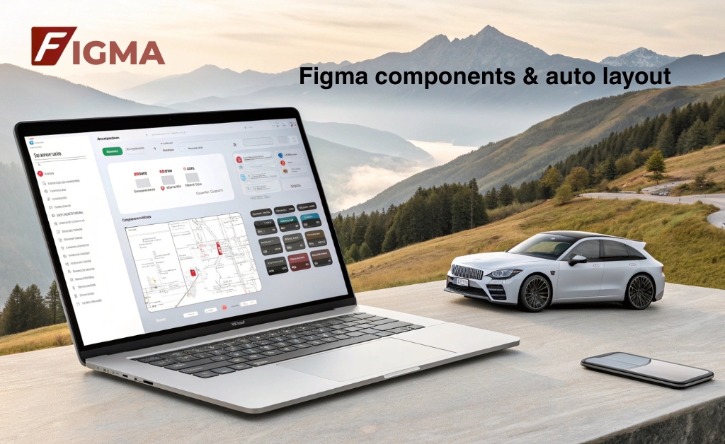
Design is never static projects evolve, products grow, features get added if your design process isn’t set up to scale, it quickly falls apart that’s where Figma’s components and Auto Layout come into play they bring order to chaos they help you work faster without losing control and most importantly, they make collaboration smoother across your team.
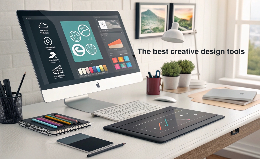
I’ve worked with a lot of tools over the years, but Figma consistently feels like a designer’s best friend it’s clean, it’s quick and once you understand how components and Auto Layout work together, you’ll never want to go back to manual resizing or scattered style guides again especially when you see how it fits within the best creative design tools you need to try for better visuals.
Why design systems matter
A design system isn’t just about consistency it’s about efficiency, when you have standardized buttons, cards, navigation patterns and spacing rules, your team moves faster you spend less time debating colors and more time solving real problems.
Stanford’s d.school teaches that structured systems in design increase creative confidence when constraints are clear, designers are more willing to explore and innovate, it’s not about limiting creativity it’s about freeing up mental space by handling the basics automatically.
Understanding Figma components
Components in Figma are reusable design elements think of them like master templates. you create one version and then use instances of it across your file, Change the main component and all instances update it’s that simple
This makes it perfect for things like:
- Buttons (primary- secondary- disabled)
- Navigation bars
- Modals and pop-ups
- Input fields
- Cards and pricing blocks
The real magic happens when your entire product UI is built with components, you want to change the radius of a button? tweak the spacing on your cards? you do it oncein the main component and everything else stays aligned.
How components and auto layout work together
On their own both features are helpful but together, they’re unbeatable. you create a component like a button, wrap it in Auto Layout and then reuse it everywhere want to make a small tweak? update the main component it flows throughout the design no more duplicate edits
Even better nested components let you build complex UIs that still scale. a card might be made up of a header, a text block and a button all of which are individual components with their own Auto Layout rules the full card adjusts based on its contents responsive design becomes easier, faster and more reliable.
Quick comparison: manual vs component-based design
| Design workflow | Manual approach | Component + auto layout |
|---|---|---|
| Update Button Styles | edit each instance individually | edit once in main component |
| Responsive Layout | manual resizing and spacing | automatic adjustments via rules |
| Team Collaboration | risk of inconsistencies | centralized, scalable components |
If you’re exploring different platforms or want to compare how other design tools handle similar workflows, this guide to the top UI UX design tools is a great place to start.
It’s not just design it’s communication
When you build with systems, you’re not just designing for users you’re also helping your teammates. developers don’t have to guess at dimensions PMs don’t have to ask for button sizes everything is documented consistent and predictable
And that consistency pays off:
Harvard Business Review reported that product teams using shared design systems reduce rework by 34% and improve time to market by up to 50% those are huge gains especially in fast-moving environments where speed matters.
Best practices for scalable systems in Figma
- Name everything clearly: Use consistent naming conventions for components and layers. It saves time and keeps your files organized
- Group components into libraries: Shared libraries let you use the same system across different projects or teams
- Use variants: Instead of creating separate components for each state (e.g, button hover, button disabled) use Figma’s variants feature to group them logically
- Document usage: Create a separate page or frame in your Figma file that shows how and when to use each component
- Test on real content: Build your components with flexibility in minduse sample content to stress test widths, heights and edge cases
Don’t stop at design link to behavior
Design isn’t static it’s part of the broader product experience, that’s why the tools you choose and how you use them affect the final result. Figma gives you the power to work at scale without sacrificing control, but it’s still up to you to build systems that respect users and reflect your brand’s intent
Figma’s components and Auto layout features aren’t just conveniences they’re the foundation of scalable, thoughtful design when you use them well your product looks better, works better and ships faster you free your team from repetitive work you reduce mistakes and you create space for deeper creativity.
As your projects grow, these systems grow with you that’s the beauty of working smart not just hard. design evolves but structure keeps you grounded, and Figma makes that structure easy to build, easy to share and easy to trust.