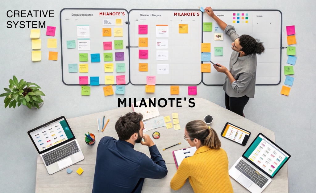
text-only notes never capture the full picture early concepts are half images, half phrases, plus a few “what ifs” in the margins milanote lets me keep all of that in one place. i can pin a headline idea next to a color swatch, park a customer quote under a mood image, then drag lines to show relationships the more I move things, the clearer the story gets momentum builds because decisions are visible not buried in a doc.
a quick, reliable setup that never gets in the way
- create a board and give it a working title, don’t overthink it
- drop in the raw materials. notes- screenshots- web links- sketches from your tablet
- group by theme, add simple columns or frames named “problem – patterns – directions”
- sequence the path, arrange from left to right so the narrative flows
- annotate decisions, when you choose one path add a short note that says why
my own boards taught me that pictures beat paragraphs, but there’s evidence too
Harvard Business Review has long recommended simple practices that raise the quality of ideation, like separating solo idea generation from group sessions and making thinking visible so teams can compare, combine and evolve concepts.
practical techniques that shine in milanote
| technique | what to capture | milanote element | pro tip |
|---|---|---|---|
| story wall | key moments in the user journey | columns with note cards and arrows | keep each step to one sentence so gaps are obvious |
| moodboard | reference images- textures- color swatches | image cards and color chips | limit to 12 images per theme to avoid visual noise |
| problem framing | the challenge- constraints- success criteria | framed section with bullet notes | write the problem as a question that starts with “how might we” |
| concept comparison | two or three competing directions | side-by-side frames with headers | list one strength and one risk under each concept |
| feedback round | comments- questions- must-haves | comment pins and checklists | ask reviewers to vote for clarity, not personal taste |
quality bar: how I keep boards clean and useful
- name sections clearly, “insights open- questions- next steps” labels beat decorations
- set a maximum if the moodboard explodes, prune it back to what actually informs the decision
- separate exploration from selection, do a wide pass, then a narrow pass don’t mix them
- write why not just what. when you choose a direction, add a one-line rationale
- sleep on it come back with fresh eyes and move three things, you’ll always see a better story
templates that save the first hour
blank pages can be scary milanote’s templates give you a starting scaffold for brand explorations, marketing campaigns, moodboards and creative briefs. I often drop in a template just to steal the section names, then adapt it to the project ten minutes later, we’re already populating the board instead of debating structure and if you want to push your ideas even further, these AI tools for brainstorming can give you fresh directions you might not have considered.
use cases that pay off fast
brand refresh: collect competitor snapshots, tone words and style references narrow to two directions and build mini moodboards for each. by the end of day one, you have something you can show a stakeholder.
product discovery: map the problem space, highlight pain points and park user quotes under the steps they belong to connect sticky insights with arrows patterns appear on their own.
content calendar: plan themes for the quarter on a single line under each theme, attach outlines, visuals and quick checklists. once a post ships, drag it to “published” the motion feels rewarding.
milanote vs a generic doc
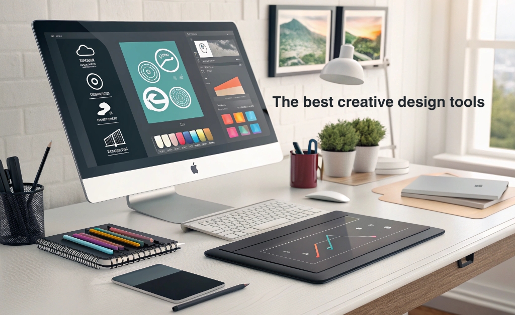
Docs are great for final writing; early on, you need a creative workbench Milanote gives you a canvas where text, images and structure sit side by side without fighting, if you’re looking to round out your toolkit beyond Milanote, the best creative design tools you need to try for better visuals is a great place to start.
my five-step workflow you can borrow today
- start with the question you need to answer, write it at the top of the board
- dump inputs for 15 minutes, no judgment text, images, links sketches
- cluster and name the clusters, three to five is plenty
- draft two competing directions, outline each in five cards or fewer
- decide on a direction, list next steps and assign owners small, clear tasks win
milanote earns its spot in my process because it respects how ideas really form messy at first, then clearer with every move if you need a space to think with your eyes and bring others along, try building your next concept on a board keep it simple, keep it tidy and keep the focus on decisions you’ll feel the difference in your momentum and in the quality of the work that follows.
If you try this setup, send me a screenshot of your board I’m always curious how a simple layout and a few strong habits can carry a team from spark to launch.